Mountain Modern Color Palette: A Summit County Designer's Guide to Colors and Finishes That Work at Altitude
Q: What Is a Mountain Modern Color Palette?
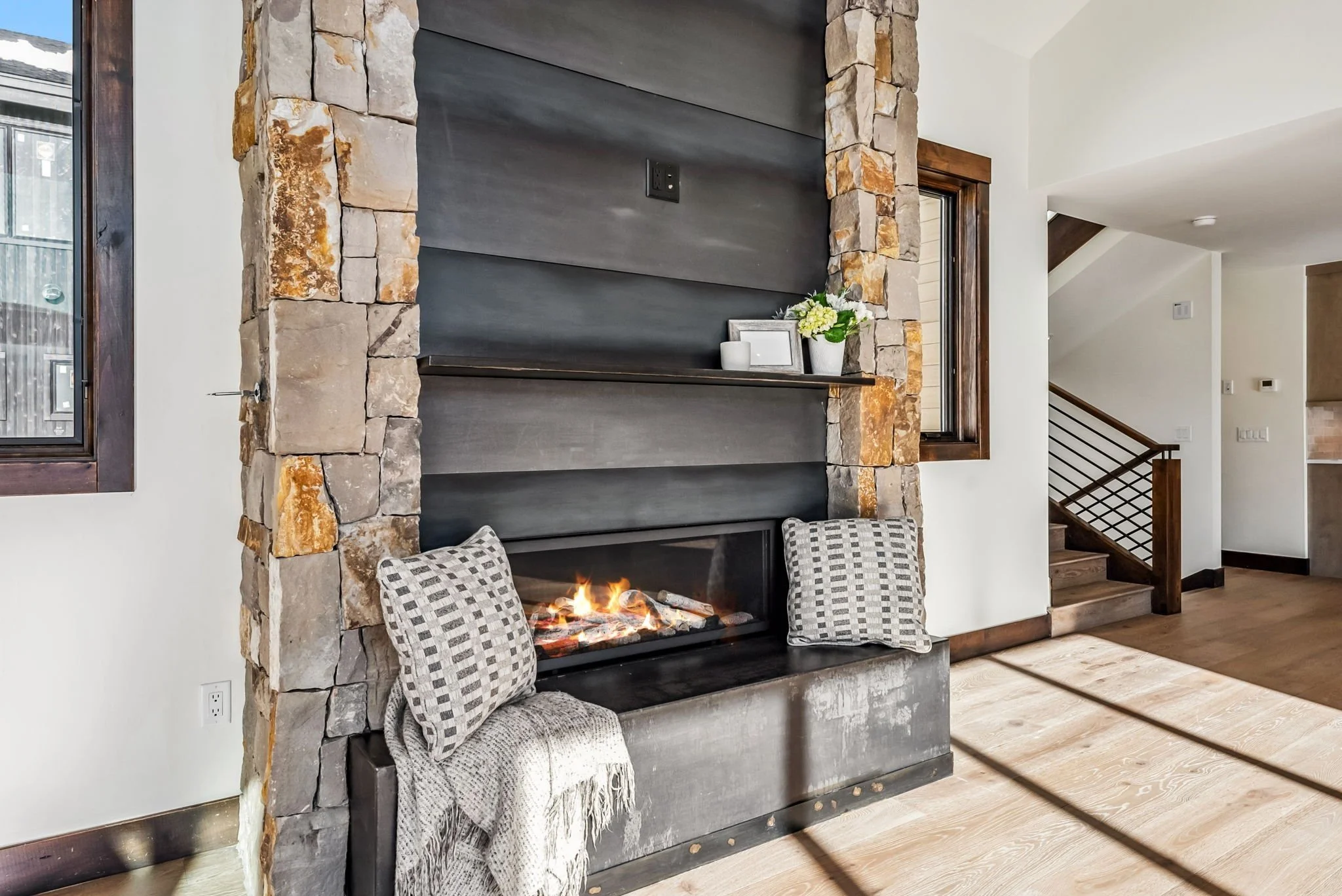
A mountain modern color palette pairs warm neutrals drawn from the surrounding terrain with deeper grounding tones and lets natural materials carry much of the color. Walls stay quiet in warm whites, soft beiges, and muted sage or gray-blue, while wood, stone, metal, and textiles add the depth that keeps clean-lined rooms from feeling cold.
Color is the place where mountain homes most often go wrong, because most palettes are chosen from a fan deck in a showroom and then asked to perform in some of the most demanding natural light in the country.
Summit County's towns sit near or above 9,000 feet. The light here is brighter, sharper, and more changeable than the light those colors were mixed for. A palette that works in Denver can look washed out in Breckenridge by noon and flat by dusk. The palette has to be built for the place.
A Mountain Modern Color Palette Starts Outside the Window, Not on a Paint Chip
The most reliable color consultant in a mountain home is the view. Lodgepole and spruce, aspen bark, granite, dried grasses, snowfields, and that specific Colorado sky are already a palette, and the house sits inside it every day of the year.
A mountain modern color palette works when the interior reads as a continuation of that setting rather than an argument with it. In practice, that usually means:
Warm whites and soft beiges instead of stark, blue-leaning white
Muted greens and gray-blues pulled from trees and shadow, not from a trend board
Browns that match the way wood weathers here
Stone tones that sit close to what is in the ground outside
One or two deeper anchors, like charcoal or a near-black bronze, to give the lighter tones something to stand against
None of this turns the house beige; it gives the palette a reason. When every color in the home can point to something outside the window, the rooms feel calm and intentional even before the furniture arrives.
Why All-White Rooms Fall Flat at Altitude
The all-white interior had a long run, and in many city homes it still works. In the mountains it has a specific problem: altitude light is not gentle with it.
High-altitude sun is intense and highly directional, and snow bounces it back into the house for a third of the year. Cool whites and pale grays that look crisp at sea level can read glaring in the middle of a January day and lifeless once the sun drops behind the ridge. Colorado Homes & Lifestyles recently described the move away from all-white interiors in exactly these terms: cool, flat palettes can flatten out against dramatic mountain light, while warmer woods, aged metals, and stone with real veining hold their character.
The case for warmth is practical. It is not that white is wrong. It is that a mountain home asks more of its neutrals than most homes do:
Morning light, midday glare, and alpenglow all land on the same wall
Snow reflection changes how cool tones read for months at a time
Rooms are often tall, so a single wall color covers a lot of visible area
Winter evenings are long, and the palette has to feel warm under artificial light too
A warm white with real pigment in it, tested in the actual room through a full day, almost always outperforms the brightest white on the rack.
Materials Carry the Color: Choose Finishes First, Paint Second
Here is the order of operations most homeowners get backwards: paint is the easiest finish to change, so it should be one of the last colors chosen, not the first.
The durable color in a mountain home lives in its materials. Flooring, cabinetry, stone, tile, countertops, metal finishes, and major textiles set the palette long before a roller touches a wall. Those selections are also the expensive ones to revisit, which is why they deserve the most care.
A materials-first palette usually gets built in this order:
Wood tones, since flooring and cabinetry cover the most surface and anchor everything else
Stone and tile, chosen to sit comfortably next to those wood tones
Metals, where aged brass, bronze, and matte black show up far more often than bright chrome in recent mountain work
Large textiles, like rugs and upholstery, that bridge the hard finishes
Paint, mixed and tested last to support all of the above
This sequencing is also the hardest stage to get right alone. Elle J Design's interior fixed finish design services exist for exactly this stage: cohesive selection of every exposed fixture and finish, detailed drawings, and renderings that show how the palette behaves in the actual rooms before anything is ordered.
Warm Neutrals Need Depth to Stay Interesting
A common fear about warm, natural palettes is that they end up boring. That happens, but not because the colors are quiet. It happens when everything in the room sits at the same value and the same texture.
Mountain Living's recent trend coverage of grounded, warm mountain palettes makes the point well: the palette is earthy neutrals as a backdrop, deeper tones for weight, and texture doing much of the visual work. Color is powerful, but texture is what brings it to life.
Depth comes from contrast. In value: pale walls need something dark to push against, whether that is a charcoal accent, espresso beams, or near-black window frames. In texture: plaster next to rough-sawn wood, wool next to leather, honed stone next to woven grasses.
It also comes from restraint. Three or four colors used with conviction beat eight colors used politely, because every addition dilutes the ones already working.
A useful test for any room: squint at it. If everything blurs into one even tone, the palette needs an anchor. If three or four distinct zones of light and dark remain, the room will feel layered even on a gray day.
One Palette Logic for the Whole Home
Mountain homes are open. Great rooms flow into kitchens, stairs stay visible, and hallways borrow light from the rooms around them. That openness means color decisions travel. A powder room can be a surprise; a great room cannot.
This matters even more in a second home. Many Summit County owners arrive after weeks away, and the first few minutes inside set the tone for the whole stay. A home where the palette holds together from entry to bedroom feels settled the moment the door opens. A home assembled one Pinterest decision at a time feels busy, even when every individual choice was nice.
Whole-home palette logic means a consistent family of neutrals, not one paint color everywhere. In practice:
Neutrals that relate from room to room without matching exactly
Repeating wood and metal finishes, so transitions feel deliberate
Saving saturated color for rooms that close, like bunk rooms, offices, and powder baths
Letting the biggest views stay the brightest thing in the room
Holding those relationships steady across rooms is the same discipline that drives mountain home space planning: whole-home decisions first, room-by-room decisions second. It is the same thinking behind mountain modern interior design as a whole: the style is a balance, and the palette is where that balance is most visible.
How Elle J Design Builds Color and Finish Palettes in Summit County
Elle J Design is a full-service space planning and interior design firm based in Summit County, working on custom homes, full remodels, and vacation homes across Breckenridge, Frisco, Dillon, and the Vail Valley. Color and finish decisions run through the studio's design phases, where selections are made as one coordinated palette instead of a series of separate purchases.
Palettes fail in the gaps: the flooring chosen in month two that fights the countertop chosen in month five, or the paint picked from a two-inch chip that turns green against the new white oak. Renderings, samples reviewed in the home's own light, and a documented finish plan close those gaps before they get expensive.
The goal is never a trendy house. Colors here are chosen to last rather than to date, because repainting a great room with twenty-foot walls is not a casual weekend refresh.
If you are staring at a wall of samples for a Summit County home and want every finish decision pulling in the same direction, you can start the conversation with Elle J Design before the big finishes get locked in.
FAQs About Mountain Modern Color Palettes
Do You Help with Paint and Finish Selections in Breckenridge and Summit County?
Yes. Elle J Design selects interior finishes, fixtures, and color palettes as part of its full-service interior design work across Summit County, including Breckenridge, Frisco, Dillon, Silverthorne, and Keystone, as well as the Vail Valley. Finish selection can be part of a new build, a full remodel, or a furnishing project.
What Are the Best Paint Colors for a Colorado Mountain Home?
Warm whites, soft beiges, mushroom and clay tones, muted sage, and smoky gray-blues tend to perform best in Colorado mountain light. The specific color matters less than testing it in the actual room, because high-altitude sun and snow reflection change how paint reads through the day.
Should Every Room in a Mountain Home Use the Same Colors?
Every room in a mountain home does not need the same colors, but each room should follow the same palette logic. Open living areas benefit from a consistent family of neutrals and repeated finishes, while enclosed rooms like bunk rooms and powder baths are the right place for deeper or more playful color.
Is White Paint a Mistake in a Mountain Home?
No, but bright, cool whites often disappoint at altitude. A white that looks clean at noon can turn gray in a shaded room and go dull under lamplight after sunset. Sample any white on two walls, one in direct sun and one in shadow, and check both again in the evening before committing to it.
Final Takeaway
A mountain modern color palette is not a list of approved colors. It is a way of letting the setting, the materials, and the light make most of the decisions, then editing with intention.
Start outside the window. Choose the finishes that are hard to change before the ones that are easy. Give warm neutrals something dark to stand against, and let texture do the work that saturated color does in city homes.
Do that, and the palette stops being a decorating decision. It becomes the reason the whole house feels like it belongs on its site, in this county, at this altitude.